Home Page
Does Cannes Lions really get design?
Author
Paul O'Brien
Date
25 Jun 2025
Share
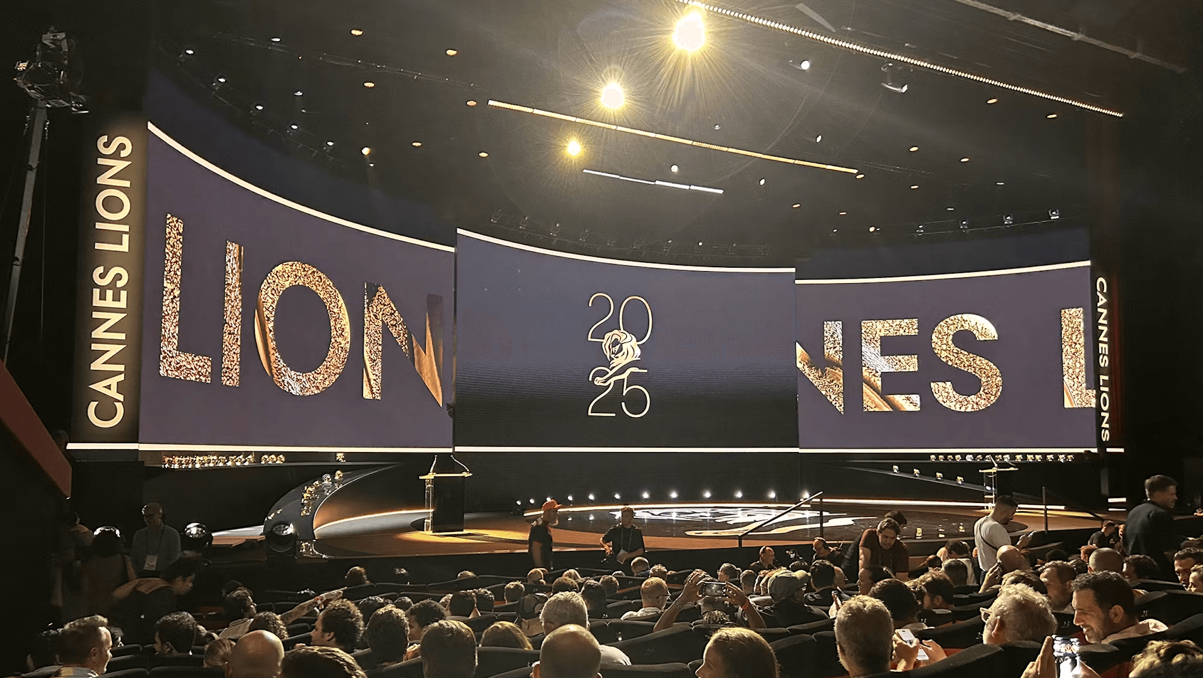
Judging the Design Lions at Cannes Lions this year was without a doubt one of the highlights of my career and an incredibly meaningful experience. It’s not every day you’re asked to sit alongside some of the most inspiring talent from all around the world to help define what excellence in design looks like on a global stage.
Spending time in the jury room gave me a front-row seat to the state of design today - what’s landing, what’s evolving and what still feels like it’s being misunderstood. It also gave me the chance to reflect on something bigger: where does design really sit within Cannes Lions today, and how much will AI play a role in the future of design.
It’s these questions I found myself asking across the week, and ones that deserve a closer look.
Design’s place in Cannes
Let’s start with the positive. Design held a rightful and respected place at the table this year. The entries showcased the full spectrum of design ranging from cutting-edge technologies to beautifully crafted print work. What stood out most was a shift towards purposeful creativity. Many submissions thoughtfully integrated sustainability and innovative technologies, making the work not only visually compelling but meaningfully resonant.
There was no shortage of ambition either. The standard was incredibly high, and it was clear when brands had invested significant time, money, resources, and care into their entries. The quality of the work, along with the craft of the case films, often elevated how effectively the design story was communicated.
At the same time, at a time when commercials are becoming more important for brand leaders, it’s no wonder I sensed a stronger emphasis on the effectiveness and outcomes of the work, sometimes at the expense of celebrating the finer crafted elements like typography, colour, tactility and material choice. These might seem subtle, but they’re often what elevate design from good to genuinely great.
Broadening the definition of what belongs at Cannes
One misconception is that only large scale, big budget work belongs at Cannes. But that simply isn’t true. In reality, design that demonstrates purpose, empathy, and thoughtful craft, regardless of scale, can stand shoulder to shoulder with the likes of Apple or Coca-Cola.
Some of the most progressive and thoughtful entries we saw this year came from less globally recognised brands, such as WORKWEAR FOR KIDS - a promotional piece for SOS Children’s Villages to raise awareness of child labour, which ended up winning a Bronze Lion for Promotional Items/Promotional Printed. What they had in common wasn’t size or spend, but intention, purpose and craft. The more we encourage brands and agencies to recognise that great design isn’t defined by budget but by impact and clarity, the more progressive, design-first work we’ll see cross the stage.
But encouraging more design-led work to be entered is only part of the picture. It’s not just about what gets submitted, but how the work is framed. The way a project is presented plays just as big a role in how they’re received and judged.
That’s especially true when it comes to experimental work. There’s nothing stopping it from being recognised, but some entries trip themselves up by spreading too thin across categories. For example, a brilliant idea might be entered into the posters, typography and editorial categories, but only be represented by a single asset. If it’s not tailored to each category, it won’t land, no matter how strong the thinking is.
Sometimes, it’s not the work that’s lacking. It’s the context.
What really makes great design stand out?
As creatives we often naturally respond to work that engages the senses. We're constantly learning through what we see, touch, taste, hear, and even smell. So, when a piece brings those tactile qualities to life, it really jumps out to you. That kind of sensory craft doesn’t just look good, it connects with people on a deeper, more instinctive neurological level, and that’s what makes it shine in the judging room. Remember, the judges are real people with real, human emotions – something AI will never be able to replace or replicate.
Sometimes it’s the simplest touches, like material choices, print techniques, or considered graphic details, that create the biggest impact. One perfect example is the unboxing of a new Apple product. It’s intentionally slow and deliberate, building anticipation and reinforcing a sense of quality and care. That kind of design thinking leaves a lasting impression.
In a lot of cases, AI was used in creative ways that added real value, not just as a gimmick. A great example of this was ‘The Shakespeare Bic’ project, which used AI to study one of the last handwritten pieces by Shakespeare himself. By analysing the letterforms, they built a full variable alphabet that brought his handwriting back to life for the campaign. It was a smart and meaningful use of technology, and it ended up winning Silver in the Special Editions & Bespoke Items category.
What Cannes Lions needs to do next
There’s a common misconception that design takes a back seat at Cannes Lions. Whilst this may be the case, in the jury room, the conversations were rooted in design thinking. Each piece that made it to the shortlist or won an award has something valuable to teach us about the power and potential of design.
That said, across the wider festival, design can still feel like it’s being viewed through the advertising lens. One way to shift that perception is by continuing to bring in jurors from traditional design agencies or practices. That way, you avoid the blurred lines between design and advertising, and ensure the work is judged through a truly design-focused lens.
What the design category needs now isn’t a rebrand. It needs momentum, more visibility. Design is evolving rapidly, and what’s important is that we continue to embrace new technologies and innovation within the category. The key is not repositioning, but ensuring the category reflects where design is heading.
Design today is much more about how things look. It’s about how they work, feel and how they connect with their audiences. If Cannes can keep championing that, it’ll be an even stronger stage for what design can really do.
This article first appeared on Creative Review here.
Further reading