Perrigo / Opill
Location
North America
Industry
- Consumer Health
What we did
Brand, Creative, Design, Social
How MSQ's joined-up thinking launched America's first over-the-counter birth control pill as a category-defining brand.

Our work with Opill delivered a groundbreaking brand identity that redefined reproductive health design standards and achieved historic market launch coverage across the North American media.
The Momentum Challenge
Opill faced an unprecedented opportunity. As America's first-ever over-the-counter birth control pill, the brand had a chance to revolutionize reproductive health access for millions of women. But with no design precedent in the category, they risked blending into traditional healthcare aesthetics that could undermine the landmark nature of this moment.
The stakes were massive: One-third of U.S. women face barriers accessing contraception. This wasn't just a product launch – it was a historic breakthrough that demanded a brand identity worthy of reshaping an entire category.
The Joined-up Solution
Rather than following conventional pharmaceutical branding, we assembled a specialized team combining cultural insight, design innovation, and brand strategy to create a completely new visual language for reproductive self-care.
We recognized this was about empowerment, not just medication. Our research revealed that women wanted reproductive health products that celebrated freedom and autonomy rather than hiding behind clinical sterility. This launch represented a cultural shift that the brand needed to embody visually.
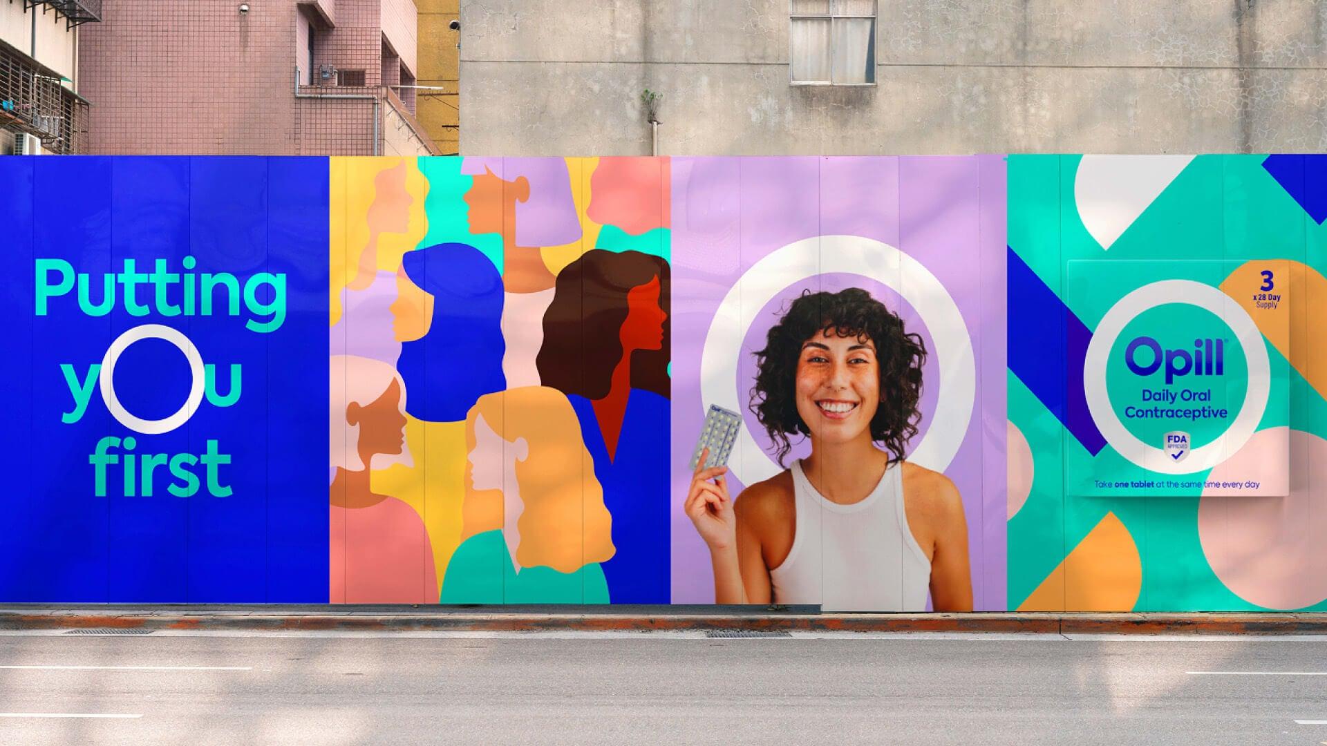
The strategic breakthrough: Instead of pharmaceutical conventions, we positioned Opill as a symbol of reproductive freedom with design that breaks free from traditional healthcare norms – creating the new standard for how reproductive health brands should look and feel.
Integrated execution across every touchpoint:
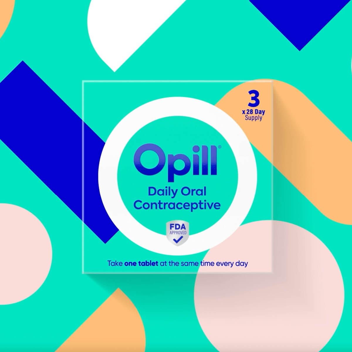
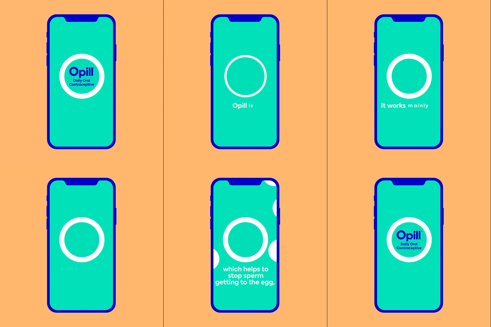
- Brand Identity: O-shaped brandmark symbolizing protection, simplicity, and ease of use
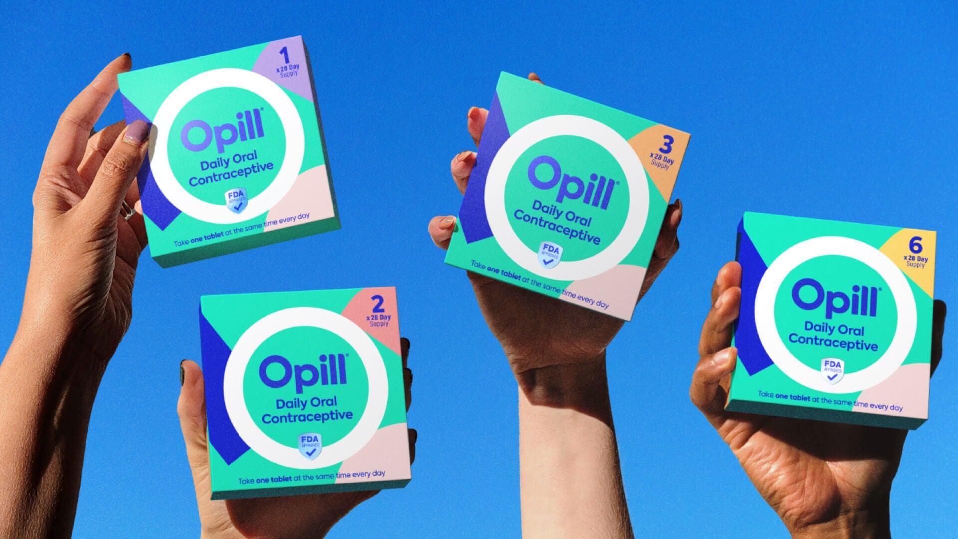
- Color System: Vibrant teal foundation with coral, lilac, orange, blush, and yellow in free-form shapes
- Typography: Open, rounded typeface adding warmth and approachability
- Packaging Design: Revolutionary departure from clinical aesthetics while maintaining credibility
- Visual Language: Freedom-focused design system that signals a new era in reproductive self-care


The Momentum Delivered
Historic launch that redefined category standards:
- First FDA-approved over-the-counter daily birth control pill in U.S. history
- National media coverage across CNN, The New York Times, Fast Company, NBC News, and Forbes
- Major partnership with Women's National Basketball Association (WNBA) announced within one month of launch
Cultural impact beyond sales:
- New design standards established for entire reproductive health category
- “Great step forward" recognition from Director of Family Planning at NYU Langone Hospital
- Multi-year partnership positioning Opill as champion of contraception accessibility
- Category transformation from clinical products to empowerment brands
The result was a cultural relevance and commercial success – combining design innovation, brand strategy, and cultural insight that transformed how an entire product category communicates with consumers.


Discover More


